
A Designer's Guide to Coordinating Workplace Furniture Finishes
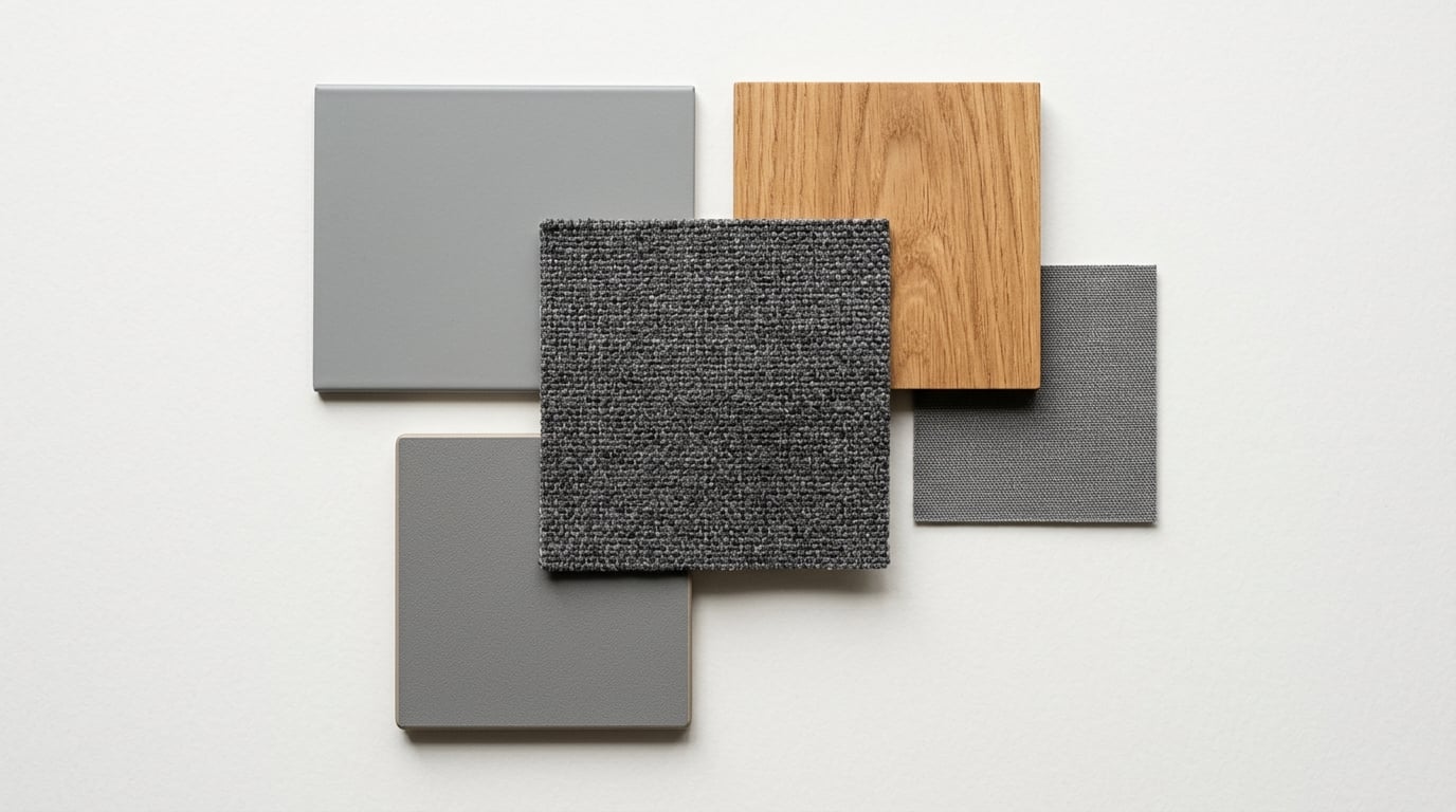
A workplace is rarely furnished from a single product family. Desks, meeting tables, soft seating, storage and breakout pieces often come from different ranges, and what makes them read as one designed scheme rather than a collection of separate purchases is a disciplined finish palette. Here is a practical way to coordinate finishes across a project.
Build a palette, then hold to it
Start by defining a limited palette: one or two timber tones, one or two neutral surface colours, a metal/leg finish, and a small family of upholstery colours with one or two accents. Resist the temptation to add a new finish for every product. A restrained palette used consistently always looks more considered than a wide one used loosely.
Keep timber tones consistent
Mismatched wood tones are the most common thing that makes a scheme feel accidental. Decide on a warm or a cool timber direction and keep desks, tables and storage within it. If you are mixing a real-wood veneer statement piece with MFC elsewhere, choose an MFC decor that sits in the same tonal family so they relate rather than clash.
Use leg and frame finishes to tie ranges together
Metalwork, desk legs, table bases, chair frames, is a powerful unifier. Specifying a single frame finish (for example a soft black, a warm grey or a light powder-coat) across products from different ranges instantly makes them feel related, even when the shapes differ. It is often easier to coordinate on frame colour than on surface decor.
Zone with upholstery, not chaos
Upholstery is where colour and personality enter a scheme. Use it deliberately: a calm neutral for the bulk of task and meeting seating, with one or two accent colours reserved for breakout and soft-seating zones to signal a change of use. Pulling accent colours from the same tonal family keeps zones distinct without the floor looking busy.
Balance texture and sheen
Coordination is not only about colour. Mix matte and lightly textured surfaces to add depth, and avoid too many high-sheen finishes, which can look harsh under office lighting. A woven upholstery, a matt laminate and a soft-sheen metal read as richer than three flat, similar surfaces.
Make a physical sample board
Screen renders and small swatches lie. Assemble the actual finish samples, timber, laminate, metal and fabric, on one board and view them together under the real lighting conditions if you can. This is the single most reliable way to catch a tone that fights the rest of the palette before it is ordered.
Because our ranges share coordinated finish and upholstery options, it is straightforward to specify tables, desks, seating and storage that belong to the same palette. Our team can help you build a finish schedule that holds together across the whole scheme.
Planning a project? Our team can help you specify the right products, finishes and lead times.
Talk to our team